Colour
OUR COLOUR PALETTE IS
BORN FROM THE LOUD, VIBRANT
COLOURS OF OUR REGION.
COLOUR PALETTE
Our colour palette features a range of spicy core colours, that are offset with a simple neutral palette. The following section aims to give clear guidance on how we use this vibrant palette to communicate our brand spirit.
Clarity Blue /
Azul Claro
#3C50FF
R60 G80 B255
C100 M75 Y0 K0
PMS 285 C
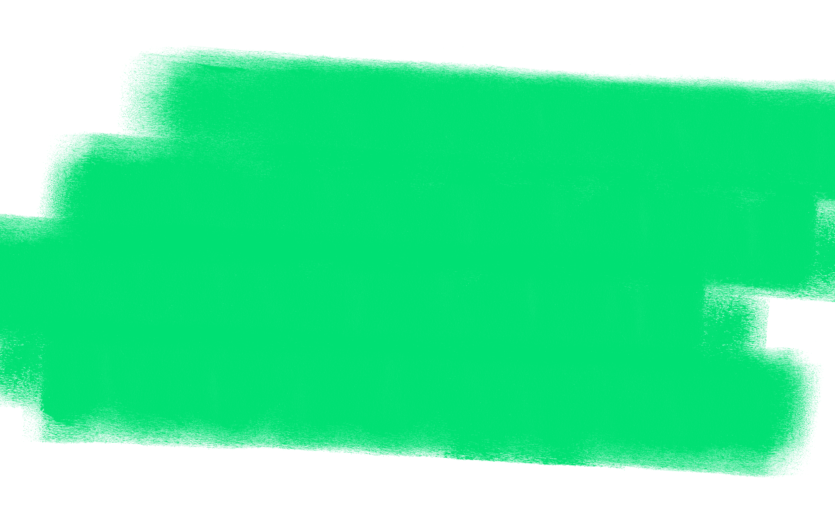
Hype Green /
Bombo Verde
#00E173
R0 G255 B115
C75 M0 Y75 K0
PMS 2420 C
Spicy Orange /
Naranja Picante
#FF5A2D
R255 G90 B45
C0 M80 Y90 K0
PMS 1505 C
Flame Magenta /
Magenta Ardiente
#FF50FF
R255 G80 B 255
C5 M80 Y0 K0
PMS 907 C
Acid Yellow /
Amarillo Ácido
#DCFF32
R220 G255 B50
C6 M0 Y100 K0
PMS 395 C
Off White
#E6E6E6
R230 G230 B230
C0 M0 Y0 K10
Black
#1A1A1A
R26 G26 B26
C5 M0 Y0 K95
PMS 447 C
White
#FFFFFF
R255 G255 B255
C0 M0 Y0 K0
Neutral colour combinations
Neutral colour combinations pair a vibrant colour with a neutral. They allow us to clearly and succinctly cut through the noise and get our message heard.
Vibrant colour combinations
Vibrant colour combinations pair two vibrant colours together. We can think of these 'Fuego' colour combinations as our ultimate. They are over the top and pack a punch – so use them purposefully and respect their power.
Combining colours
with textures
We can use our textures to overlay two sets of colour combinations. Thinking about designs as two separate layers coming together will be a helpful way to choose the best colours for your communications, and make sure you don't overload on colour. Here are some suggested colour combinations using textures.


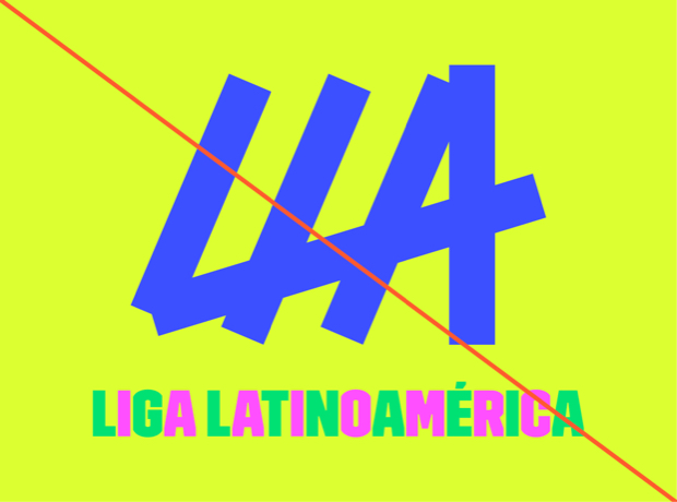
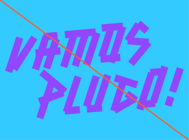
Misuse

01
Do not use colour combinations that make your text or graphic difficult to read. Only use the combinations indicated in this document.
02
Do not recolour our logo, or any other graphic asset in ways that are not specified in this document.
03
Do not introduce colours into our palette that are not specified in this document.

04
Always limit colour usage. If it is overused, our brand palette can very quickly look like a rainbow. Use colour to enhance where necessary. Less is more.