Typography

OUR BRAND TYPOGRAPHY AMPLIFIES
THE PASSION, ATTITUDE AND SPICE
STRIKING A BALANCE BETWEEN
PASSION AND PROFESSIONALISM.
Our
typefaces
Our typography helps us express the two sides of our personality – 'Fuego' and 'Hielo'. Our custom font 'Fuego tapetype' embodies our passion and spice. Our supporting typefaces ground us – making sure our brand can also be clear, to the point, and professional.
Tape
Type
Trim Poster
Tapetype
Our headline font 'Fuego tapetype' encompasses our passion and DIY spirit. As with our logo, our tapetype is able to be quickly and easily recreated by our fans. To add energy and variety, each letter in our tapetype has a series of alternates.
Using tape type
Here are some simple rules to keep in mind when designing with our custom built 'Fuego Tape Type'.
Following this guidance will make sure our Tape Type is used consistently and always looks its best.
Characters
Use alternative characters to make the font feel raw and handmade
Trim poster
Trim poster average is authoritative, cool and calm, creating a solid foundation for our communications.
Using trim poster
Following this guidance will make sure Trim is used consistently and always looks its best.
Headline
Font
Trim Poster Average
Alignment
Centered or Left aligned
Leading
90%
Tracking
+20
Kerning
Optical
Combining type
Here are some examples of both our 'Hielo' and 'Fuego' type styles working together, and also suggestions for when to use this system.
The example on this page shows the 'Fuego tapetype' working well to build hype with an excited sign-off message, as well as being used to draw attention to a call to action.
For more guidance around messaging, see the tone of voice section of the guidelines.
Supporting typeface
We use this for additional information and body copy. It is robust and reliable typeface, and we only use two weights – Regular and Semi bold.
Using calibre
Our supporting typography can only be used in neutral brand colours. In this example it’s white text on black background. Always ensure there is enough contrast for maximum legibility.
Body Copy
Font
Calibre Regular + Semi Bold
Alignment
Left aligned
Leading
120%
Tracking
+20
Kerning
Optical
Misuse

01
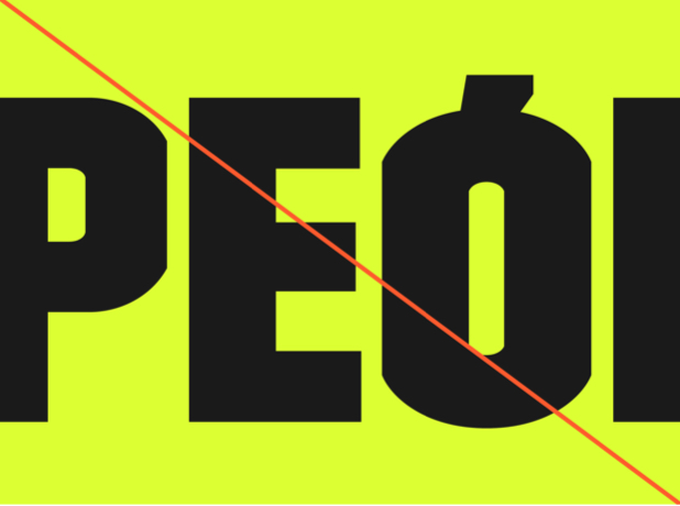
Our headline font Trim contains accented letters that join the letter with the accent. These do not read well in spanish, so please only use the accents that are not connected.

02
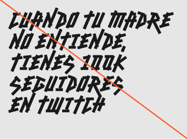
Do not use our 'Fuego tapetype' to set full paragraphs of text. It should only be used for headlines, at a maximum length of 8 words.

03
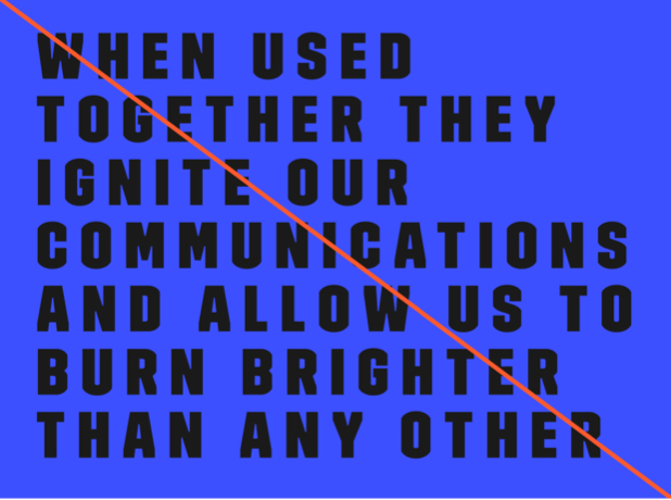
Only use our typography at the spacing specified in this guidelines document. Spacing things incorrectly will result in designs not feeling apart of the same brand.

04
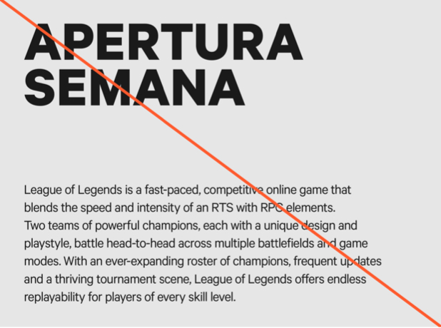
Only use our typefaces in the hierarchy specified in this document. For example, do not use our supporting typeface Calibre as a headline, or our headline font Trim as body copy.