Texture

OUR BRAND PALETTE INCLUDES A RANGE
OF TEXTURES. THEY HAVE BEEN CREATED
TO MATCH THE SAME DIY, GRASSROOTS
ETHOS AS OUR FUEGO TAPETYPE.
Textures
Our textures reveal and highlight content, and allow our vibrant colour palette to show itself.

Using textures
to reveal
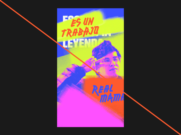
We can use textures to reveal the 'fuego' within our brand. We might use textures to add colour to the design and grab attention.
Avoid using too many textures and colours, because keeping our designs clean and simple will help us stand out in a cluttered environment.

USING TEXTURES
TO HIGHLIGHT
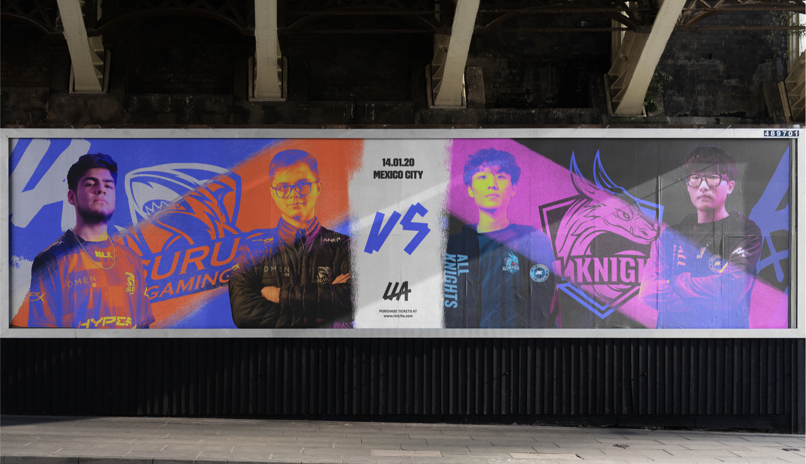
Our textures can also highlight information – creating hierarchy to help viewers understand what we are trying to communicate.
During broadcast we can use textures to help us visually highlight the player that the shoutcasters are discussing.


USING TEXTURES
TO DRAW ATTENTION
We can use our colour treatments to help draw attention to information we want to highlight. Here are some examples using various gradient placements to highlight each section of a communication.
This is a simple system to help you clearly communicate whatever message you are sending to your audience, and also helpful in limiting the amount of 'Fuego' within a design at any one time.


Templates
We have a series of texture templates available to use in any LLA communication.
The textures are supplied as masks in Photoshop, and there is guidance in the section below as to how to apply these to your designs.


HOW TO APPLY
TEXTURES
When applying a texture template to your designs, follow this step-by-step guide to ensure your files are consistent and designs are on-brand.
You can also watch our tutorial video on how to use texture templates.
Toolkit
Before you choose your template, ensure you have the designs for the two layers already designed or in mind. This will help you choose the right texture template.
Toolkit
Before you choose your template, ensure you have the designs for the two layers already designed or in mind. This will help you choose the right texture template.
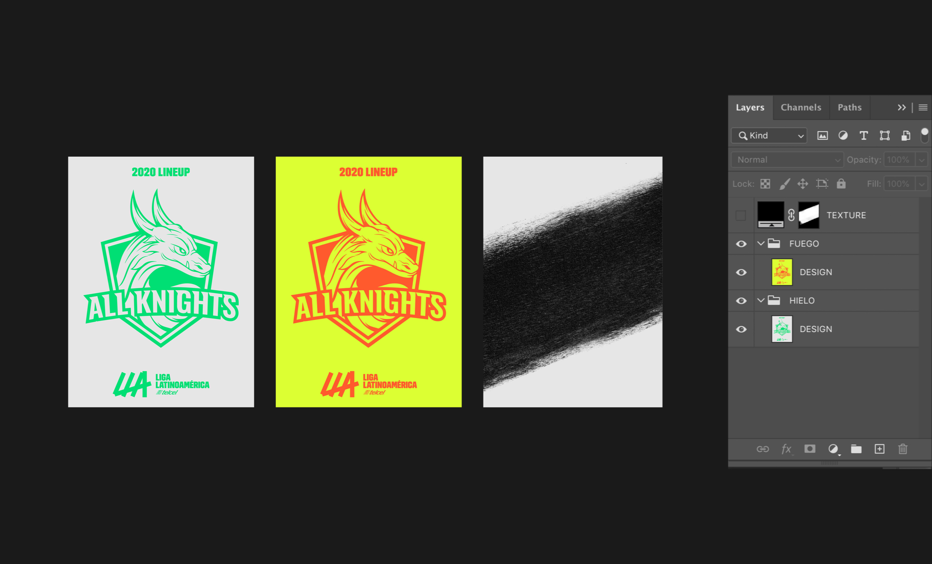
Step 1 – Building Hielo
Design your base layer using your selected colour palette. This example shows how we might welcome a new team to the league. You may find it helpful to name the layer HIELO.

Step 2 – Texture placement
Choose a texture template that will help communicate the message to the viewer (eg. highlighting the logo of the team that has just joined the league.)

Step 3 – Adding Fuego
Duplicate your base design in a folder called FUEGO, and choose a complimentary colour combination. This is the layer that will reveal through your texture template.
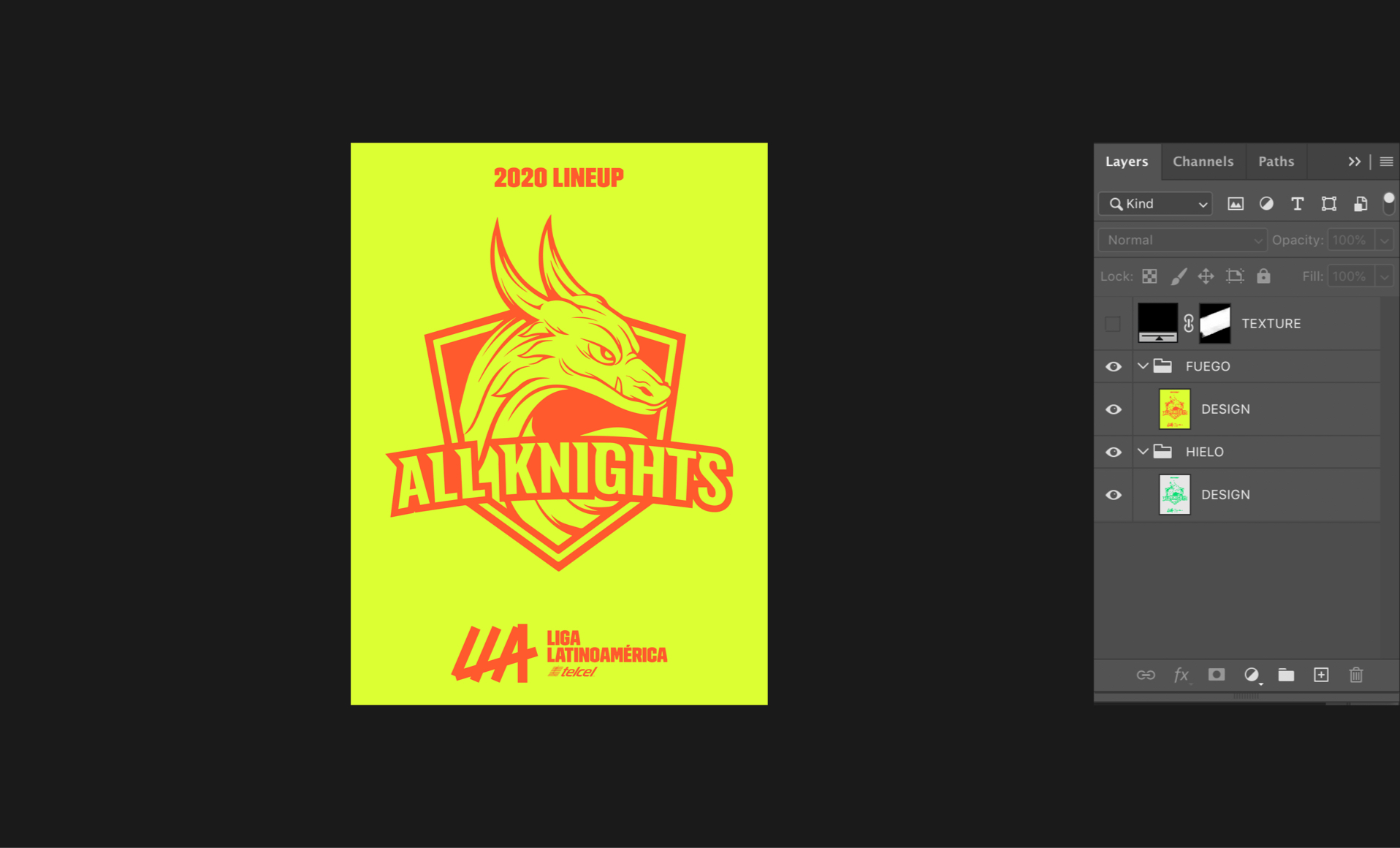
Step 4 – Revealing Fuego
Apply the mask from your texture layer to the FUEGO layer, so it can be revealed over the HIELO layer.

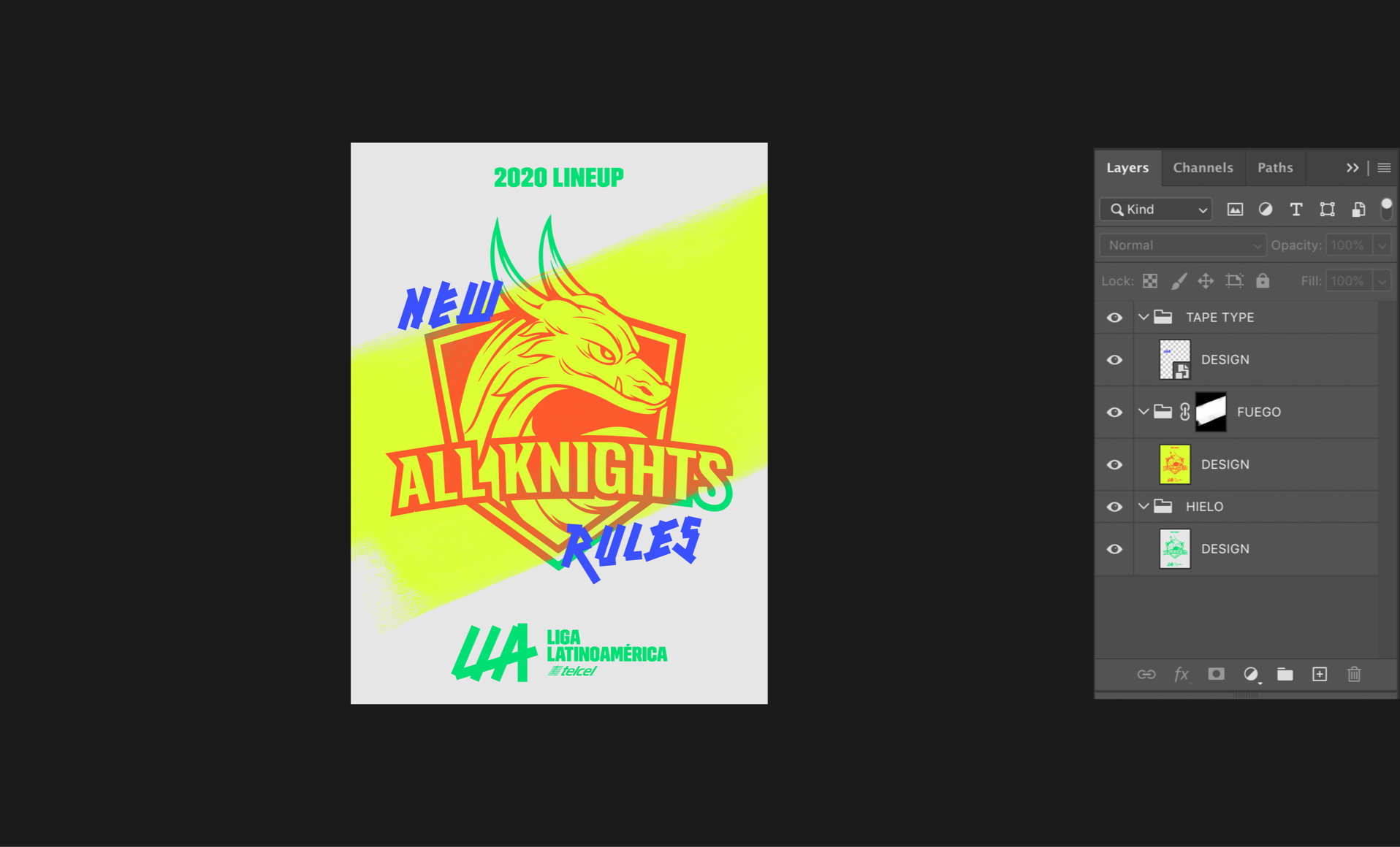
Step 5 – Adding an additional message
If necessary, layer over an expressive message using the LLA tapetype, making sure it compliments the design visually.
Misuse

01
Do not overlap or create patterns out of textures. Keep things simple. Textures do not need to appear in every design.
02
Less is more. Restricting the use of textures overall will help enhance their impact when they are used.

03
We never use textures within textures. Too many layers complicates things.

04
Only use textures to enhance your communication, rather than distract from it. Also always only use the colours and gradients specified in this document.
For more guidance, see the Colour section.