Design
System

Our brand embodies two different
modes which allow us to create
balance, contrast, and drama within
our communications – revealing our
true colours to the world.
Design
Concept
Our brand has been designed with two modes. ‘Hielo’ and ‘Feugo’. Together they allow us to create balance, contrast, and drama within our communications – revealing our true colours to the world.
Hielo
AUTHORITATIVE, COOL, CALM AND COLLECTED; HIELO LOOKS YOU STRAIGHT IN THE EYE, AND TELLS YOU LIKE IT IS.
Hielo’s powers:
- Delivering information simply and clearly
- Setting up remarks for Fuego to spark
- 3. Getting the LLA taken seriously
Fuego
OUR PASSION, OUR SPICE, OUR FIRE. FUEGO LAUGHS WITH YOU – AND OCCASIONALLY AT YOU. IT’S NEVER AFRAID TO GO THERE.
Fuego’s powers:
- Sparking attitude
- Injecting some of our opinion as a league
- Bouncing off Hielo to make the crowd laugh
Design
Principles
Always keep these two principles in mind when designing communications for our brand. They will help our designs feel clear, considered and consistent.
Over the next few pages we will break these two principles down in more detail.
PRINCIPLE 01:
FOCUS THE FUEGO
We have a lot of firey elements within our brand toolkit, so it's important we use them wisely.
Here are 3 examples that each focus on one 'Fuego' element at a time.
Focussing on one firey element per communication will help create a singular point of focus, avoiding over complicated designs.
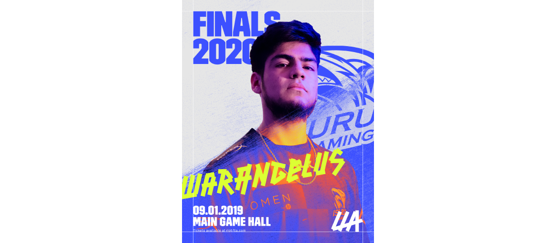
Example 1
Hielo text + Fuego highlight
Example 1
Hielo text + Fuego highlight
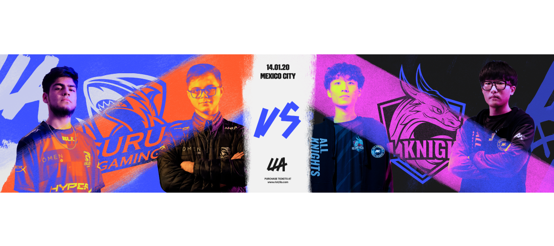
Example 2
Hielo text + Fuego colour gradient
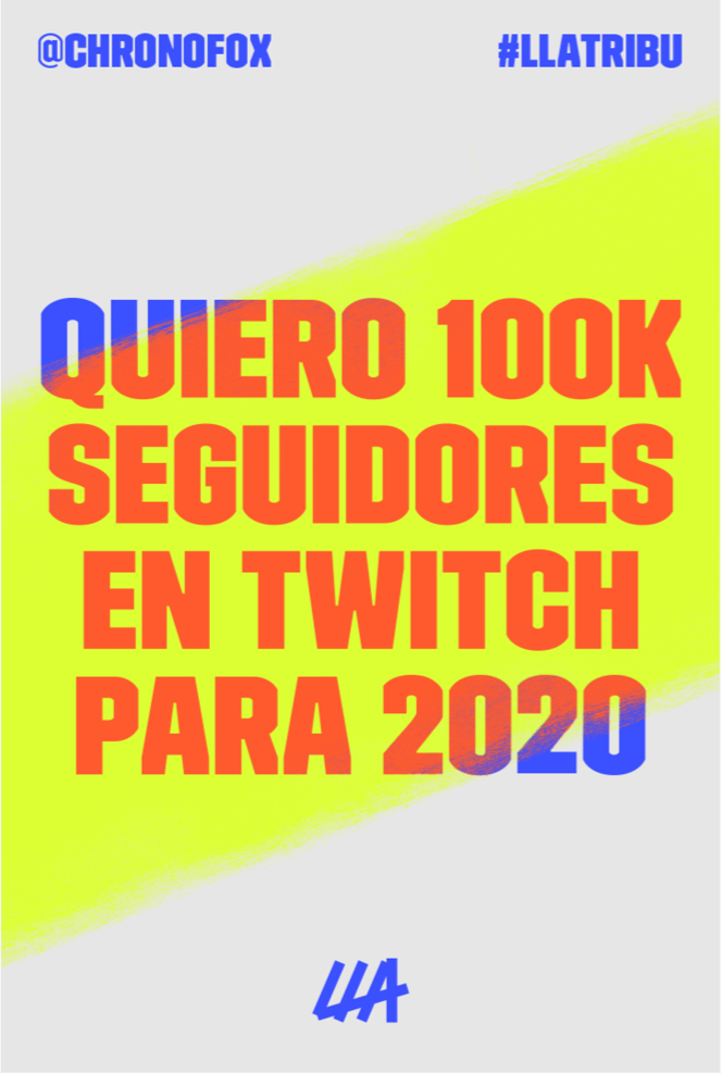
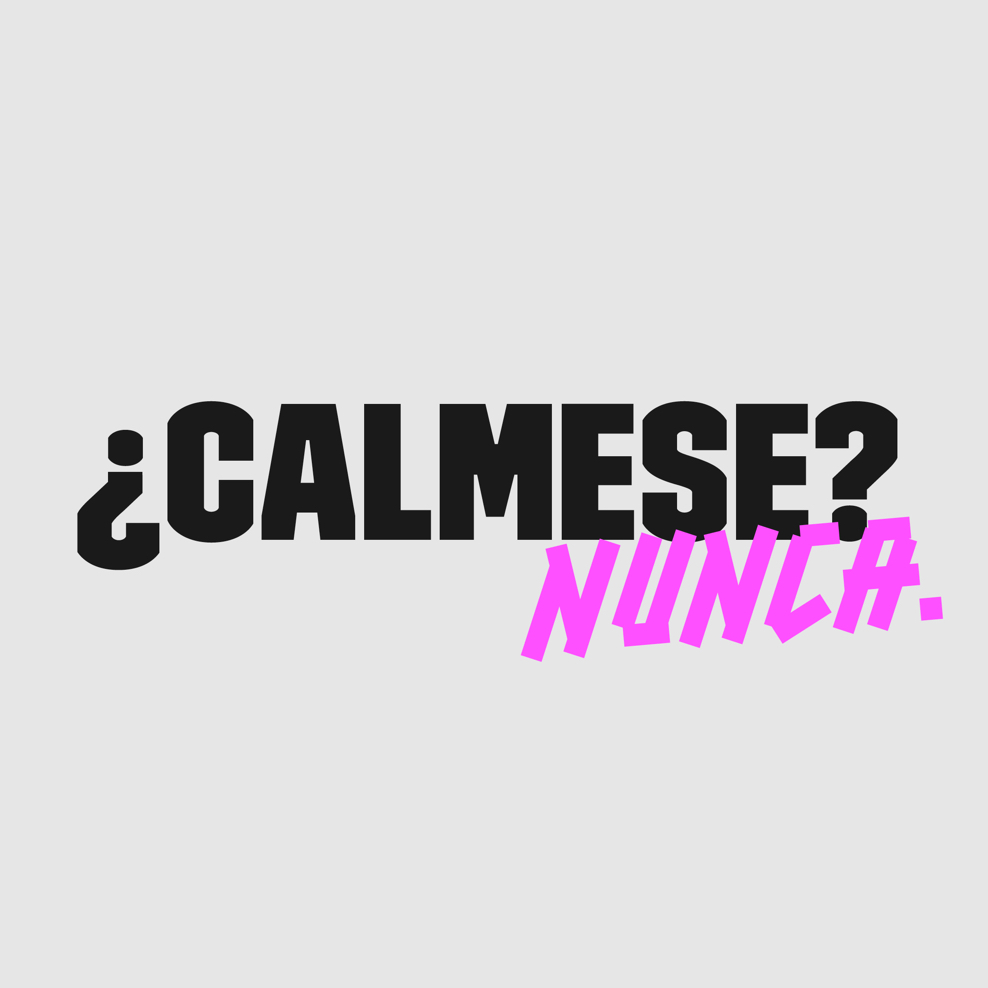
Example 3
Hielo text + Fuego tape type
PRINCIPLE 02:
KEEP IT HIELO
The cool, calm and collected side of our brand is just as important as our fire. Our colour and type alone can pack a punch, so if in doubt – keep things 'Hielo'.
Here are 3 examples of our 'Hielo' elements creating strong, simple designs on their own.
Example 1
Hielo colour + type
Example 1
Hielo colour + type

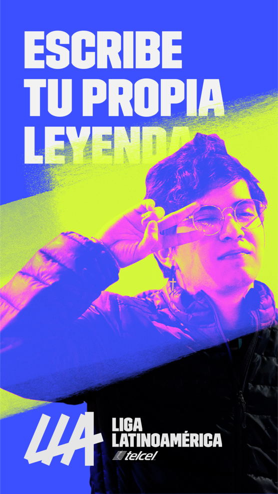
Example 2
Hielo text + Fuego colour gradient

Example 3
Hielo text + Fuego tape type
WORKING TOGETHER
Here are some examples of communications that feature our graphic elements working together. This breakdown helps explain the design system in more detail.